Winvesta's Website Revamp
Full revamp of the Winvesta marketing site with a modern, unified design - Simplified navigation & improved information architecture - Integrated all key product pages and feature highlights - Designed supporting marketing and social media assets
00

problem
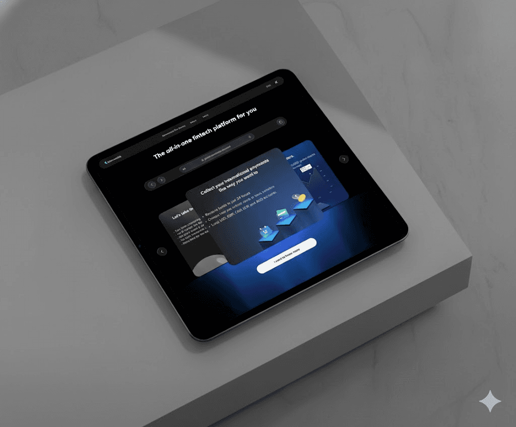
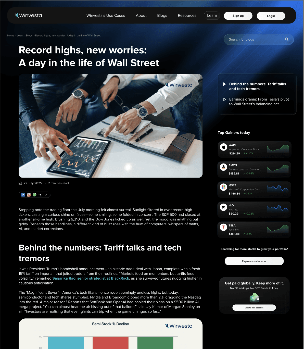
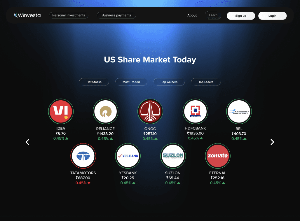
Winvesta’s existing marketing website had grown organically over time, resulting in fragmented navigation, unclear messaging, and inconsistent visual language. While the product itself was powerful, the website did not clearly communicate its value proposition to new users, leading to confusion and drop-offs during exploration.
solution
The website was completely reimagined with a focus on clarity, structure, and conversion. Navigation was simplified, product information was reorganized into clear sections, and a unified visual system was introduced to strengthen brand consistency. Key product features were surfaced more prominently, supported by focused marketing and social media assets.
The revamp began with understanding how users discovered and evaluated Winvesta. By aligning the site structure with real user intent, the redesigned experience guides visitors smoothly from awareness to action. The result is a modern, cohesive marketing website that reflects Winvesta’s global fintech positioning while making complex financial products easy to understand at a glance. You can find the results at winvesta.in
01
02
03
see also


